
Overview
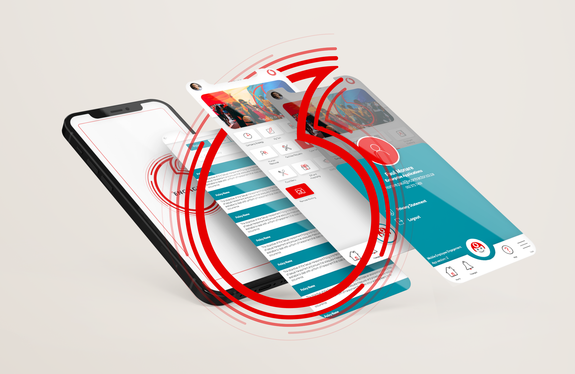
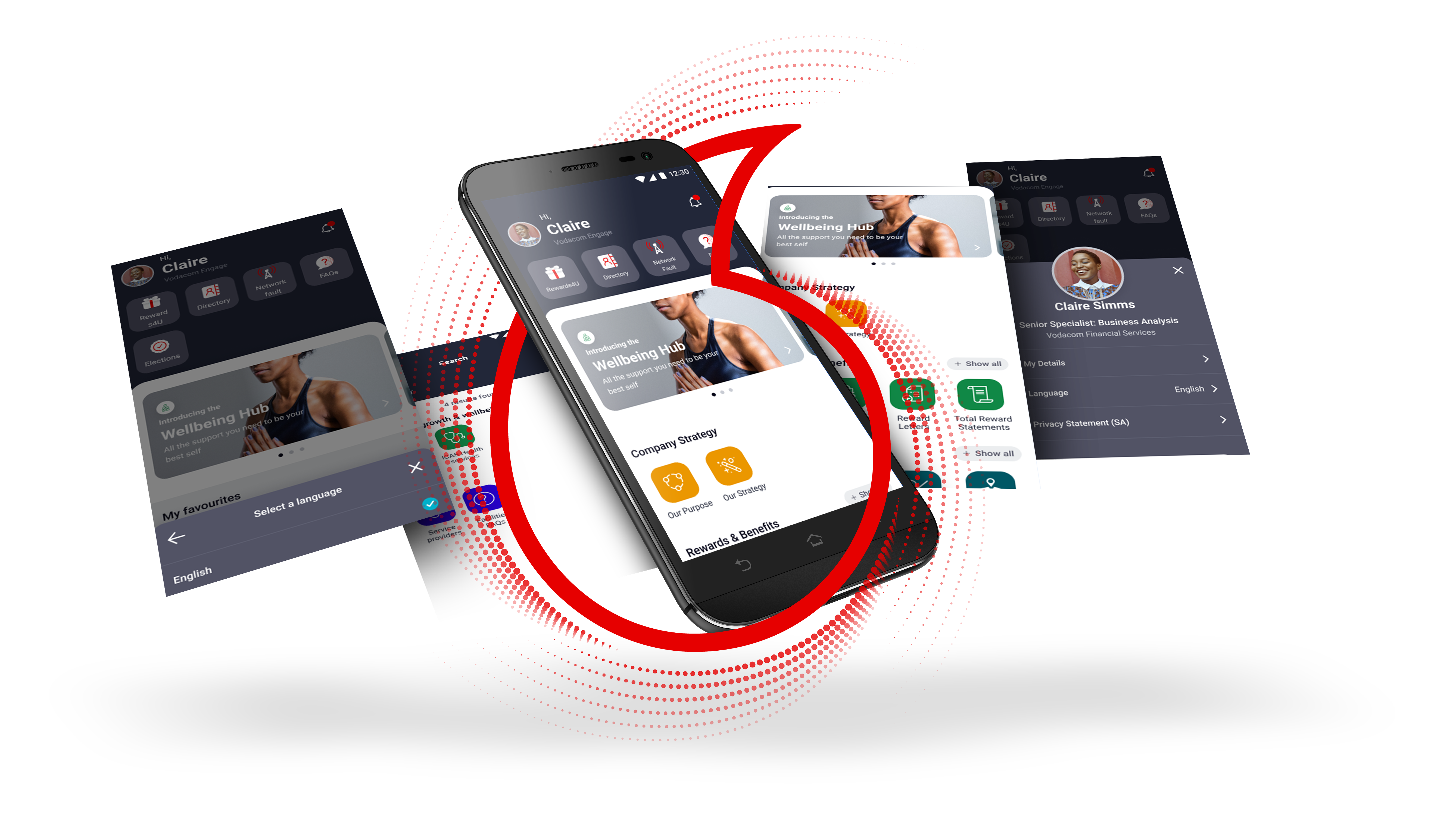
As part of my role in redesigning the employee engagement app, the goal was to resolve several user pain points related to navigation and feature discovery. The original design presented users with a landing page that featured a company logo as a GIF loader, followed by a scrolling banner displaying the latest communications and tiles that led to various features, articles, or external apps. However, users reported difficulty in finding key features, leading to confusion and frustration.
In this redesign, my primary objective was to improve the app’s usability and user experience by rethinking the navigation and information architecture. The process involved:
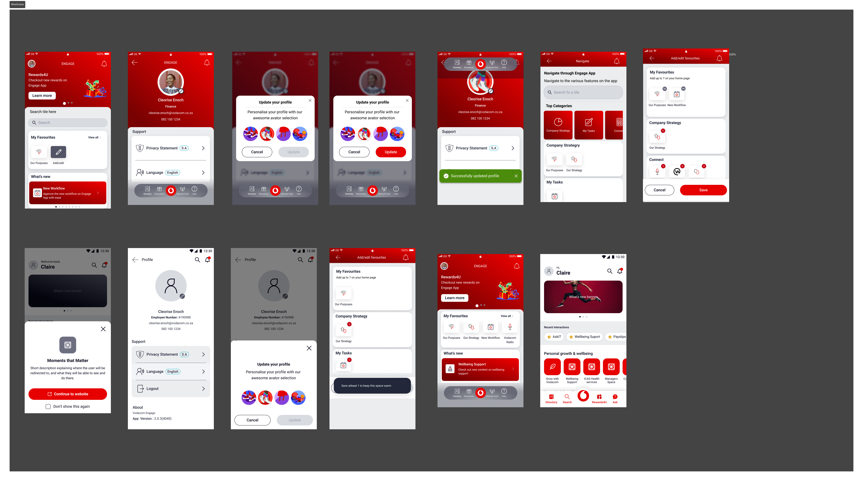
- Introducing a search feature to allow users to easily locate features, content, and tools within the app.
- Grouping tiles into meaningful sections that reflected the nature of the content or feature, such as:
- “Safety, Health and Wellbeing” for anything related to employee wellness and safety.
- “Policies and Information” for company policies and procedures.
- “Smart Buildings” for campus-related information.
- “Rewards and Benefits” for all benefit-related features.
- “Company Strategy” for strategy-focused content.
- “Apps Section” for linked applications.
- Adding a chatbot section to showcase all available bots, providing users with quick access to chat-based tools.
- Incorporating a profile icon with a floating menu for users to view details about themselves and the app.
- Introducing a favorites section below the scrolling banner, enabling users to pin their most-used features for easy access.
Design Process
- Research and Analysis
- User Feedback: I gathered insights from existing users, who had expressed difficulty navigating through the app’s features. They found it challenging to locate key functions, often requiring multiple steps to find what they needed.
- Competitive Analysis: I reviewed similar apps in the employee engagement space to see how they tackled navigation and feature discoverability, noting common patterns in grouping content.
- Wireframing and Prototyping
- I started by creating low-fidelity wireframes to map out the new user flow, focusing on simplifying navigation.
- Grouped tile sections based on themes, ensuring users could logically navigate to features within familiar categories like “Wellbeing,” “Policies,” or “Company Strategy.”
- Designed the search functionality with filters to allow users to search for features, content, or tools quickly.
- Integrated a chatbot section that listed all available bots within the company, making it more accessible.
- Developed a new “Favorites” section below the scrolling banner, allowing users to pin their frequently accessed features.
- High-Fidelity Mockups and User Testing
- After refining the wireframes based on feedback from stakeholders and early testers, I created high-fidelity mockups using Figma.
- Conducted usability testing with a group of employees to validate the new design, focusing on the search functionality, tile grouping, and the “Favorites” section. I measured how quickly and easily users could find the features they were looking for and gather feedback on their overall experience.
- Iterative Refinement
- Based on user feedback, I made small adjustments to improve visual hierarchy and consistency. For instance, the chatbot section was enhanced with icons to make it more visually appealing. The profile icon menu was expanded to provide users with a more detailed view of both their app usage and available personalization options.
- Implementation and Launch
- I worked closely with developers to ensure smooth implementation of the new design. I provided the necessary design assets and documentation to ensure the layout, responsiveness, and interactive elements were properly integrated.
- Post-launch, I monitored user feedback and app analytics, noting a significant improvement in feature discoverability and overall user satisfaction.
Results
- Increased User Engagement: The search feature and categorized tile sections made it easier for users to find what they needed, reducing frustration and improving overall engagement with the app.
- Improved Navigation: Users could now navigate the app intuitively thanks to meaningful groupings of tiles and the addition of the favorites section, allowing quick access to frequently used features.
- Enhanced Usability: The chatbot section and profile icon added more functionality and personalization options, while the floating menu provided easy access to user and app details.
This redesign significantly improved the app’s usability, making it easier for employees to engage with the platform and access the tools they needed efficiently.